I wrote up this review for a short exploratory paper about an LA art event for Prof. Lyford's Contemporary Art class and I thought I would share it here also.
I recently attended Redcat’s exhibition Everyday Miracles featuring the work of contemporary Asian female artists Hamra Abbas, Ringo Bunoan, Chen Hui-Chiao, Shilpa Gupta, Kan Xuan, Minouk Lim and Jewyo Rhii. The show uses a variety of media including sculpture, video, photography and installations to explore themes of race, society and politics—along with the miraculous—across contemporary Asia through quotidian materials and various elements of the everyday.
I was particularly intrigued by a photographic work by Hamra Abbas entitled Paradise Bath of 2009. Abbas was born in Kuwait and now lives and works in Islamabad and Boston. Traditionally Abbas works in sculptural forms but for this piece she hired a photographer, Serkan Taycan to take the shots. The photos depict a white female being luxuriously and sensuously bathed by a darker woman in an ancient Ottoman Bath House in Thessaloniki, Greece. Interestingly, this was the only piece in the show which had an accompanying description below the work’s tombstone information. These images intend to subvert the archetypal Orientalist scene and the female nude to investigate themes of Greece’s muslim past, highlighting issues of race, memory and power. The work also examines notions of purity and washing which are essential in Islam. The use of female nudity is also noteworthy considering Abbas is a Pakistani artist and the work deals with Islamic themes.
Another provoking piece is Shilpa Gupta’s Untitled Don’t See Don’t Hear Don’t Speak from 2008. The three photos depict dozens of young Indian boys dressed in western clothing, one wearing a large, gaudy gold watch, covering one another’s eyes, mouths, and ears in various poses. These over life size digital prints are printed on flex material, giving the piece the feeling of a mural. Previously Gupta has photographed persons of all ethnicities doing these same gestures and plastered the photos on billboards throughout Bolzano, Italy. Gupta generally works in diverse media including interactive video, websites, objects, photographs, sound and public performances, As her website explains, her work “probe[s] and examine[s] subversively such themes as desire, religion, notions of security on the street and on the imagined border.” Don’t See Don’t Hear Don’t Speak plays on the story of the three monkeys with the adage see no evil, hear no evil, speak no evil which has been associated with Mahatma Gandhi. Gupta uses the allusion to comment on the tendency towards obliviousness and senselessness in the face of capitalism and strident individualism.
Everyday Miracles is a successful show in that it showcases provocative, avant-garde work by artists who do not fit into the often male dominated world of contemporary art—particularly in Asian countries. The works in Everyday Miracles move beyond a feminist discourse into a wider arena of social and political commentary using fresh alternative media. From Chen Hui-Chiao’s use of ping-pong balls in Here and Now: Sound Falling II to Ringo Bunoan’s wood pallets which make up Bridge, the works presented are vibrant and have an urgency in their execution which is difficult to ignore.
Wednesday, December 2, 2009
Tuesday, December 1, 2009
My Barbarian at MOCA's 30th Birthday Party - Review #4
On Saturday, November 21 The Museum of Contemporary Art of Los Angeles had its 30th birthday party/members opening party for it’s show Collection: MOCA’s First Thirty Years. The party featured performances by the Los Angeles-based artist troupe My Barbarian which was founded in 2000. The party took place on the Grand Avenue plaza, centered around the large Nancy Rubins sculpture. Put on by MOCA’s Engagement Party, My Barbarian’s performance was entitled "The Fourth Wall" and engaged with themes from Augusto Boal’s Invisible Theater where, as MOCA’s website describes, “social and legal constructions are interrogated by stealth performances: performers enact the conflict/situation within a public space and engage directly with bystanders in an attempt to address political issues.”
To achieve this effect My Barbarian interviewed museum staff, from curators to accountants, and created performance, music and video which directly addressed the institution of the museum. Focusing on issues of transparency, the group used the museum interviews to more critically delve into the institution of MOCA and the creation and development of Collection: MOCA’s First Thirty Years.
At various points throughout the evening the group (in various costumes/guises) infiltrated the party goers, dancing and participating in various performances where it seemed as though one artist was giving vague performance instructions to two other artists who then acted out the directions as they saw fit. The performances had a feeling of improvisation and spontaneity and the artists were extremely gestural, focusing on the visceral body in space. Although the Barbarians performed throughout the party space, including by the bar and around the line while museum-goers were waiting to go inside to see the show, the majority of the dancing took place in a semi-cordoned off space which unfortunately obstructed much of the view of these performances.
Throughout the evening a group of actors performed scripts written by Alexandro Segade from interviews with MOCA staff. I found these readings to be the most provocative element of My Barbarian’s performance as they directly interrogated MOCA and the museum as institution, openly contemplating MOCA’s financial hardships—why they occurred and how they could be mediated. One interesting topic they brought up was the controversial act of deaccessioning and selling works of art to raise badly-needed finances. The various actors debated the pros and cons of such an act, making specific references to works on show in MOCA’s Collection (such as how much money the museum’s famous Jackson Pollock would bring in). While one of the actors argued that the deaccessioning of work must be done, another contended that to deaccession donated works was tantamount to treason against donators and also damaged the integrity of the museum and its collection. By bringing up these critical issues at MOCA’s 30th birthday party, a time for celebration and revelry, My Barbarian was engaging the musuem-going audience in important issues for the museum’s future. The actors also critiqued MOCA’s architecture by criticizing Arata Isozaki’s postmodern structure as dated and unsightly—all this while museum members are lounging around the plaza, drinking cocktails and socializing.
In addition the goup wrote and performed a song entitled “Transparency” about the development and maintenance of a public art museum. The lyrics were inspired by interviews with all different types of MOCA staff. Some provocative sections are:
Do you feel secure in your job?
Oo oo oo oo oo oo oo oo oo
Can you describe the feeling within the institution during the period of crisis?
Oo oo oo oo oo oo oo oo oo
What would be so bad about selling off the collection?
Oo oo oo oo oo oo oo oo oo
The theme of My Barbian’s performance was transparency in the museum institution and to bring some of the inner workings of the museum to light and give a behind-the-scenes look at the development of such a monumental exhibition as Collection. Working in a lineage of institutional critique, My Barbarian used provocative performances which engaged with the museum-goer’s space and changed the way one may view an exhibition, particularly one of a museum’s permanent collection during a financial crisis.
Friday, November 20, 2009
Debby Davis
In the chapter "Marks of Identity", Brandon Taylor briefly mentions artist Debby Davis. In his discussion of abject art he writes, "Debby Davis has made cubes that are anything but pure: they are cast from the form of compressed, dead animals." This description piqued my interest as no other information is given about Davis. I looked her up online at debbydavisart.com and while the website shows no pieces from the 1990s there is a variety of her current work. I was most intrigued by two of her projects: "Big Litter" and "Meat".
"Big Litter" seems to be a collection of photographs of found discarded objects which range from little plastic baggies to feathers and single earrings. The presentation is deadpan, Davis is almost scientifically documenting and cataloging these dirty objects.
More in line with Taylor's description of Davis's work is her "Meat" series. In these works of the past few years Davis sculpts pieces of meat into geometric shapes and places the forms in incongruous spaces. Here are some of the more interesting photos:
Wednesday, November 11, 2009
New Topographics Symposium at LACMA - Review #3
This past weekend I attended the symposium “What’s at Stake? New Topographics: Photography and the Man-Altered Landscape”. The talk included lectures and discussions on LACMA's current show which is a reenactment of the groundbreaking 1975 exhibition New Topographics.
New Topographics was curated by William Jenkins at the International Museum of Photography at the George Eastman House in Rochester, New York and included the work of Robert Adams, Lewis Baltz, Joe Deal, Frank Gohike, Nicholas Nixon, John Schott, Stephen Shore, Henry Wessel, Jr., and Bernd and Hilla Bechner. The style of the photography is photography seemingly without style—a deadpan look at American (and in the Bechners’ case European) life without nostalgia, devoid of monumentality. The work is reminiscent of Ed Ruscha’s artist books like “34 Parking Lots” and he is cited as an influence by many of the artists involved in the show. Using conceptual art techniques such as seriality and systems, they worked with alleged detachment which gives the pieces in the show a cool appearance. Their subjects are the banalities of everyday life--from industrial office buildings, as in the work of Lewis Baltz, to the grain elevators of Frank Gohlke.
LACMA’s current reenactment of the show runs from October 25-January 3, 2010 and includes more than two-thirds of the photographs by the original participants along with supplementary work related to the show. This includes a few of Ruscha’s artist books along with Robert Smithson’s original article on the Monuments of Passaic and Dan Graham’s “Homes for America”. There is also a first-edition copy of Robert Venturi and Denise Scott-Brown’s Learning from Las Vegas (which is also available in Oxy’s special collections, as is Ruscha’s Every Building on the Sunset Strip).
On hand to speak about this important exhibition was an esteemed group of panelists, including Douglas Crimp. Although I was unable to attend the first session in which Crimp, Philipp Kaiser, Britt Salvesen and Richard Meyer were discussing the question of curatorial reenactment, I was able to participate in the second session “Learning from New Topographics.” The speakers were Matthew Coolidge of The Center for Land Use Interpretation (CLUI), professor Norman Klein, and Christopher Hawthorne, architecture critic for the Los Angeles Times. They discussed New Topographics in the context of the 1970s: the energy crisis, political turmoil, war and particularly the context of man’s relationship to the land—issues which were being grappled with in New Topographics and still resonate today.
Coolidge related Los Angeles’s intimate relationship with oil and shared his research on this history of Los Angles as an oil field. In the re-staging of New Topographics at LACMA, CLUI added a high-definition video of a flight over the oil pumps at Kern County. The piece resonates with the show because it has the feeling of detached documentation, yet while watching it—seeing miles of oil infrastructure and hearing the sounds of the helicopter mix with the ominous hum of oil pump machinations—one is faced with man’s vast alteration of this desert(ed) landscape.
Christopher Hawthorne looked at the connections between New Topographics and what was happening in architecture at that time. This is a particularly significant topic because most of the work in New Topographics features the built environment. Hawthorne explained that the show presented a landscape and building as it is—with banality and detachment. He also looked at the seriality of these works, and the photographic medium juxtaposed with buildings, of which there is generally only one. An audience member asked the fascinating question of Hawthorne: "what about tract homes? Couldn’t they be viewed in terms of seriality?” The tract home does seem to be a huge influence on many of the artists in the show, particularly Lewis Baltz and I find that to be a more interesting connection than Hawthorne’s focus on the monumental building. Hawthorne also brought up how New Topographics connects to today in that the show looked at how people were taking over the environment and now environmental anxiety (along with economic anxiety) is taking over us. To press this point he presented fascinating pictures from Detroit which showed abandoned houses overrun by nature. These current pictures mirror some of the work in the 1975 show which also shows homes with vastly overgrown yards.
At the end of the talks was a preview screening of James Venturi’s documentary on his architect parents “Learning from Bob and Denise.” In their groundbreaking book of 1972 Learning from Las Vegas, Robert Venturi and Denise Scott-Brown made it okay to look at “ugly and ordinary” buildings as something worthy of study. The documentary preview provided an excellent coda to the discussion of a show which used art techniques of systematizing and seriality to critique the obfuscation of the banalities of modern life.
Sunday, November 8, 2009
I've Found Philip Smith!
Philip Smith was one of the artists involved with the Pictures exhibit of 1977. His work was omitted from Douglas Crimp’s critical essay about the show for October (1979) and thirty years later completely absent from the Metropolitan Museum of Art’s retrospective exhibition The Pictures Generation, 1974-1984. In a previous post I questioned Smith’s absence from Pictures history along with the lack of information about him available on the internet. My curiosity piqued, I did some in-depth searching and found him!
Philip Smith not only paints but is a writer and was formerly the managing editor of GQ magazine. Last year he came out with a memoir entitled Walking Through Walls in which he relates his experiences growing up with a father who was obsessed with the paranormal—talking with the dead and healing the sick. In fact, if one finds the book on Amazon one is treated to an Amazon video of Smith talking about his book and his art:
“To me being an artist was like being a magician. You were able to see things no one else could see and you were able to take that invisible vision and make it tangible and share it with other people—it was like a magic trick. My paintings became kind of like a mystical obsession but I wanted to take some of [my father’s] ideas and the way I could do it is through painting. And for me the paintings happen almost in a trance state not unlike when [my father] would be healing. And I go into this state where I don’t know anything else that’s going on, the painting is talking to me and it’s telling me “put this image here, put this image here, this image is talking to each other, this energy is coming up this way”, and that’s how I make these paintings.
Interestingly, while I wrote the book I couldn’t paint because I realized that I’m telling the story of my father and my family, which is the same story I tell in my paintings, this time I was putting it in words, as opposed to paint. I didn’t want to be redundant so I stopped painting, now that the book is done I can go back and start painting.”
Smith’s official website is www.philipsmithart.com and it is complete with a gallery of work, exhibitions Smith has been involved in, and contact information.
Monday, October 19, 2009
Long Beach Exposed -Review #2
On Friday, October 9 I visited the opening of “Long Beach Exposed” produced by the Greater Long Beach Arts Lab. The show highlights innovative sculpture and installation work with sixteen pieces from nineteen emerging artists related to the Long Beach arts scene. Located in a defunct 25,000 square foot furniture store repurposed into a temporary art gallery, Long Beach Exposed is an exciting exhibition of the best of new Southern Californian art.
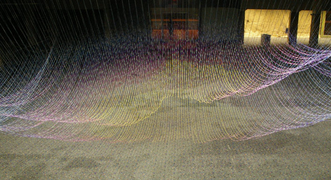
When entering the voluminous open space of the first floor one is immediately struck by the monumental yet airy site-specific installation by the Ball-Nogues Studio. An architectural firm, the Ball-Nogues Studio is known for their large “structures” of painted string, called Suspensions, of which another smaller version is currently on display at MOCA’s Pacific Design Center. Multi-colored string is suspended from the ceiling to create huge waves which undulate as one moves around the piece. Light bounces off the multiple colors, radiating differing effervescent glows depending on the viewer’s perspective. The piece masterfully mixes handicraft with digital design. The string connotes traditional needlework, yet the piece is conceptualized using computer software and a special machine designed by the Ball-Nogues studio creates the variegated string.
The overall effect is an overwhelming sensory experience that seeks to challenge notions of the temporality of imposing structures. As co-creator Gaston Nogues explained in an interview, “We think this has implications for architecture, approaches to thinking about architecture that are more unconventional. I mean what is really a building? Does it have to be made with drywall and be there forever? We’re trying to challenge those ideas.” Stretching the boundaries of architectural practice, Suspension is awe-inspiring in its translucence, ephemerality and complexity.
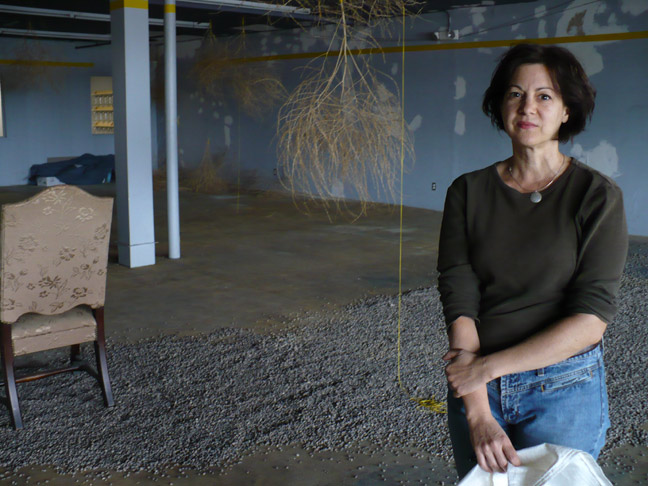
My favorite piece of the evening is an enchanting installation by artist and set-designer Melissa Ficociello. Ficociello transformed an upstairs room of the building into the site of a mythic western fairy tale by covering the floor with gravel (which loudly crunches under the visitors’ shoes) and tying dozens of hanging tumbleweeds to the ceiling. A lone spotlighted chair is placed in the center of the room, vaguely recalling the space’s original purpose of furniture sales. The walls are left untouched with varying splotchy paint colors and visible infrastructure (presumably from unfinished restoration) all of which help to emit a sense of decaying industry. Combined with the tumbleweeds and the unexpected pebbles under one’s feet, the room projects an otherworldly feel, as though it has been overtaken by a deserted garden in an alien landscape. The installation provides a fresh and peaceful experience which is wholly disconnected from the hubbub of the surrounding video art, much of which seems randomly placed and rather repetitious.
Another absorbing installation is “Nestation”, located in a downstairs nook that may have been a furniture salesman's office in the building’s previous incarnation. The work is part of a series entitled Beau Monde Float Thirteen-Six Views of Sound Beauty and was designed by Marco Schindelmann and Karen Cruise with the collaboration of Hope University, a daytime program for developmentally disabled adult artists. Schindelmann and Cruise transformed the room into a nest overflowing with branches, long multi-colored crocheted tubes and other nest-like objects. Throughout the evening gallery-goers would themselves nest, enjoying a glass of wine and conversation while sitting in this oversized human-scaled roost. The work is intended to explore varying notions of beauty, aesthetic prejudice, and the role of environment in human development. Speaking with the artist (who I found perched in the nest knitting) the role of the marginalization of the developmentally disabled was a profound source of inspiration. In an interview Schindelmann explained that
Despite its lack of a cohesive theme and video art which mostly falls flat, “Long Beach Exposed” is a successful show made up of a talented group of artists who have created immersive installations which transport the gallery-goer through sensorially transformative pieces.
When entering the voluminous open space of the first floor one is immediately struck by the monumental yet airy site-specific installation by the Ball-Nogues Studio. An architectural firm, the Ball-Nogues Studio is known for their large “structures” of painted string, called Suspensions, of which another smaller version is currently on display at MOCA’s Pacific Design Center. Multi-colored string is suspended from the ceiling to create huge waves which undulate as one moves around the piece. Light bounces off the multiple colors, radiating differing effervescent glows depending on the viewer’s perspective. The piece masterfully mixes handicraft with digital design. The string connotes traditional needlework, yet the piece is conceptualized using computer software and a special machine designed by the Ball-Nogues studio creates the variegated string.
The overall effect is an overwhelming sensory experience that seeks to challenge notions of the temporality of imposing structures. As co-creator Gaston Nogues explained in an interview, “We think this has implications for architecture, approaches to thinking about architecture that are more unconventional. I mean what is really a building? Does it have to be made with drywall and be there forever? We’re trying to challenge those ideas.” Stretching the boundaries of architectural practice, Suspension is awe-inspiring in its translucence, ephemerality and complexity.
My favorite piece of the evening is an enchanting installation by artist and set-designer Melissa Ficociello. Ficociello transformed an upstairs room of the building into the site of a mythic western fairy tale by covering the floor with gravel (which loudly crunches under the visitors’ shoes) and tying dozens of hanging tumbleweeds to the ceiling. A lone spotlighted chair is placed in the center of the room, vaguely recalling the space’s original purpose of furniture sales. The walls are left untouched with varying splotchy paint colors and visible infrastructure (presumably from unfinished restoration) all of which help to emit a sense of decaying industry. Combined with the tumbleweeds and the unexpected pebbles under one’s feet, the room projects an otherworldly feel, as though it has been overtaken by a deserted garden in an alien landscape. The installation provides a fresh and peaceful experience which is wholly disconnected from the hubbub of the surrounding video art, much of which seems randomly placed and rather repetitious.
Another absorbing installation is “Nestation”, located in a downstairs nook that may have been a furniture salesman's office in the building’s previous incarnation. The work is part of a series entitled Beau Monde Float Thirteen-Six Views of Sound Beauty and was designed by Marco Schindelmann and Karen Cruise with the collaboration of Hope University, a daytime program for developmentally disabled adult artists. Schindelmann and Cruise transformed the room into a nest overflowing with branches, long multi-colored crocheted tubes and other nest-like objects. Throughout the evening gallery-goers would themselves nest, enjoying a glass of wine and conversation while sitting in this oversized human-scaled roost. The work is intended to explore varying notions of beauty, aesthetic prejudice, and the role of environment in human development. Speaking with the artist (who I found perched in the nest knitting) the role of the marginalization of the developmentally disabled was a profound source of inspiration. In an interview Schindelmann explained that
various communities create the equivalence of nests, and nests are really environments in which certain trait sets are perpetuated and so within nests even though you do have nurturing you also have competition, you have exclusion. The developmentally disabled community is a marginalized community although twentieth century art was very much informed by such communities, aesthetically speaking. We decided to show the exhibition space as a microcosm of what occurs within the nest as well.By itself, the work does not clearly articulate this position. On the contrary, I found the piece to be comforting rather than restrictive, a site of nostalgic childhood fantasy rather than a cutting critique of art world exclusion.
Despite its lack of a cohesive theme and video art which mostly falls flat, “Long Beach Exposed” is a successful show made up of a talented group of artists who have created immersive installations which transport the gallery-goer through sensorially transformative pieces.
Saturday, October 10, 2009
What about Philip Smith?
In class we recently read Douglas Crimp’s essay on Pictures, a show he organized for Artists Space in fall 1977. Pictures was an historic exhibition in that it addressed the radical photographic technique of appropriating recognizable media imagery as opposed to the conceptual and minimalist work popular in the 1960s and ‘70s. Although the essay describes the work of the majority of the artists involved in the show (Troy Brauntuch, Sherrie Levine, Robert Longo, and Jack Goldstein), along with one not in the show (Cindy Sherman), there is little discussion of the work of PIctures artist Philip Smith.
Just this year the Metropolitan Museum of Art exhibited “The Pictures Generation, 1974-1984” which was curated by Douglas Eklund. The large show, which featured works by over 30 artists influenced by Pictures techniques, also omitted Philip Smith. Explaining his decision for excluding Smith’s work Eklund disclosed in an interview with Jess Wilcox in Art in America online edition: “As for the relegation of Smith, I don’t have any idea why that happened. When I reviewed his work for this show, it seemed not strong enough to be included; it was a curatorial, aesthetic judgement on my part.”
So why is Smith’s work seemingly replaced by Sherman’s in the Pictures commentary and left out of the recent Met show?
CultureGrrl cornered Douglas Crimp as he was walking through ‘The Pictures Generation” show and asked him what he thought about the conspicuous omission:
“Q: What do you make of Philip Smith’s absence from the Met’s show?
A: He was not so much of the group, of the social world, of the people who formulated this. He’s gay and this [the Met’s show] is a very straight configuration of artists. I don’t know what’s happened to him, career-wise. It’s a slightly touchy subject: I think Philip is upset, reasonably.”
As Crimp suggested, Smith is upset over the situation. He wrote a scathing letter to Art in America which explained his concern over being written out of Pictures history.
While Eklund was responsible for Smith’s exclusion from the Met show, why was Smith’s work left out of Crimp’s October essay on the original Pictures show? Although his work is more drawing-based, he was still a part of the original show and it seems odd that he is so conspicuously erased from this important era in the history of photography.
Saturday, September 26, 2009
Resurgence of Painting in the 1970s and '80s
Proponents of the return of figure painting in the 1970s and 80s felt they were, like Lucian Freud, painting like the Old Masters, or, like Georg Baselitz, taking the figure to places it hadn't previously been. Minimalists and conceptualist artists generally thought this resurgence of easel painting was bourgeois and reflected the conservative culture of the late 70s and 80s.
Lucian Freud:
Georg Baselitz:
Lucian Freud:
Georg Baselitz:
Sunday, September 13, 2009
Bergamot Station & Todd Goldman
This past Saturday I checked out Bergamot Station's fifteenth anniversary exhibition. Navigating through throngs of gallery-goers I made my way to the packed James Gray Gallery. On exhibit was the work of Todd Goldman, his bright, popping colors drawing the crowds at least as much as the gallery's bar, which happened to be in the same room. Unframed canvases were stacked floor to ceiling with Goldman's signature cartoon characters emblazoned with pseudo-ironic phrases like "Boys are stupid, throw rocks at them" and "You say I'm a bitch like it's a bad thing!"
Besides his admonition for "Peas on Earth", Goldman's art never enters political territory, preferring the silly and superficial to thought provoking pieces which grapple with the major issues and zeitgeist of our time. He does tiredly appropriate works by Pop icons such as Andy Warhol's soup cans (Goldman transforms them into "Poop cans") and Roy Lichtenstein's comic strip aesthetic. In the following video at Goldman's opening at the Pop Factory, the reigning Queen of Pop Culture Paris Hilton calls him the "Pop icon of his time."
Goldman is the founder of the company David and Goliath (davidandgoliathtees.com) which makes a variety of merchandise including clothing, books, and posters emblazoned with his simply-rendered cartoons with characters like "Trendy Wendy" and "Goodbye Kitty". Unlike other highly commercialized artists like Takashi Murakami (who also created a group of characters and works with companies like Louis Vuitton on merchandising), Goldman seems to be a businessman first and "fine artist" second (or third). According to The Wall Street Journal, the company made 90 million dollars in 2004. Akin to Andy Warhol's Factory, he calls each of his stores "Stupid Factory." There is even a stupidfactorytv channel on Youtube which is filled with short (approximately 30 seconds) clips of Goldman's animation:
David & Goliath merchandise is clearly aimed at teenage girls, and while I wouldn't say Goldman takes on feminist issues, his work is decidedly "anti-boy." Goldman's male characters are infantile, have cooties, pick boogers and smell. The most pro-male product I can find from David & Goliath's online store is a profound magnet which reads "I 'heart' my penis." Goldman's females are bitchy and catty--but that's considered a good thing.
So what's the appeal of Goldman's appropriated pop art/comic strip turned T-Shirt turned obnoxious handbag? I went to his personal website (toddharrisgoldman.com) and although the site has a strong visual appeal, with "clickable" items ranging from a banana and post-it notes to a "dumb-blonde sex tape" dvd case (poking fun at Paris Hilton, no doubt), none of the links work. Like his paintings, Goldman's site is visually striking but superficial. There's no linking to a proposed bio, gallery of commissions nor press reports.
And Goldman has received his share of press. In 2007 he was accused of plagiarizing Dave "Shmorky" Kelly, a web cartoonist, for copying a piece with the quote "Dear God Make Everyone Die" (It's so clever, how could he resist?). He later issued a public apology, but much of his work has been criticized as unoriginal. Appropriation is a feature of much modern and contemporary art, but Goldman walks a fine line with certain compositions and phrases bordering on plagiarism. A website called "Todd Goldman: Art Thief" created by Mike Tyndall (www.miketyndall.com/todd_goldman) meticulously chronicles the prevalent similarities between Goldman's characters, David & Goliath merchandise, and his fine art with other cartoonists, early computer graphics and common clip art.
Conceptual artists of the 1960s and '70s fervently used performances, video art and happenings to erase the "objecthood" of art which they felt was wrapped up in a bourgeois capitalist culture. Completely opposed to their work, Goldman seems to be unabashedly commercial, blurring the line between fine artist and shop owner. Precursors to Goldman include Claes Oldenburg's legendary "Store" and Keith Haring's "Pop Shop" (which is still open online at www.pop-shop.com -- where one can buy a trendy Haring eco-friendly beverage container!). While Oldenburg was surely critiquing the business of the art world, Haring explained that he wanted to bring his work to the masses--not just those able to afford his original pieces. Besides Goldman's stated claim of just wanting to make people laugh, whether with him or at him, his company seems to have no motives other than to make money.
Art Business News reports that collectors of Goldman's work include Paul McCartney, Jessica Simpson, John Goodman and the Wayans Brothers. Nearing the end of the evening I spoke to gallery-owner James Gray, who was in a decidedly ebullient mood. I asked him what the deal with Goldman was, to which he relayed that just that evening he sold sixteen of his pieces.
So I guess someone thinks they're funny.
Subscribe to:
Posts (Atom)